

In the 2000s, Ed Ruscha's exploration of text paintings continued to evolve, reflecting a deepening interest in the interplay between typography, motion, and the enigmatic quality of language. This period in Ruscha's work is marked by his innovative use of typefaces and the physical manipulation of text to create visual and conceptual tension.
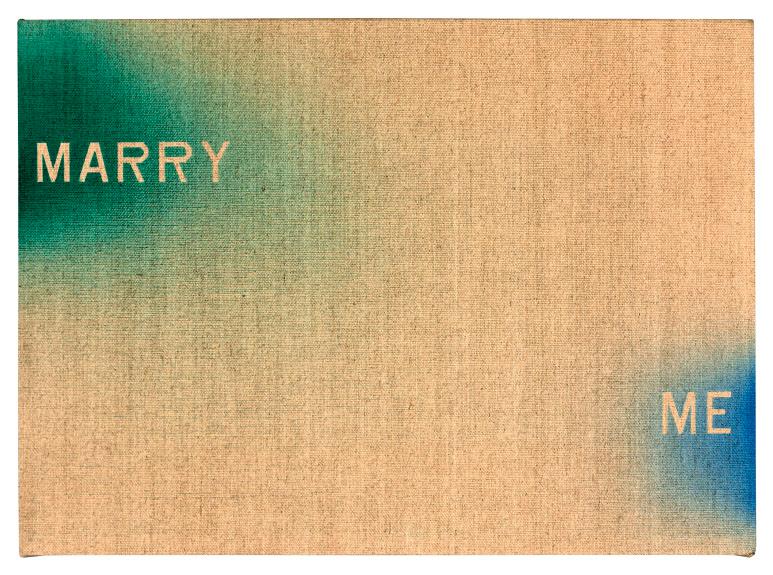
A significant aspect of Ruscha's work during this time is his engagement with motion in the depiction of words. This is not just about words in a static sense but about capturing them in motion or suggesting movement through the way they are rendered. Ruscha's use of the elegant Garamond typeface, known for its classical serifs and proportions, alongside the more unassuming Boy Scout Utility Modern font that he developed, showcases his interest in juxtaposing different styles to create visual paradoxes. This choice of typeface plays a crucial role in his work, creating a contrast between the refinement of Garamond and the depicted diffusion of the words, illustrating one of the many formal paradoxes that Ruscha's art sustains (Gagosian).
Ruscha's technique in this era is characterized by a sense of animation within his text, an optical flicker that brings the words to life beyond their semantic meaning. This dynamic quality is a testament to Ruscha's continual experimentation with the medium of text painting, pushing the boundaries of how language can be visualized and understood.
Moreover, Ruscha's work in the 2000s is reflective of a broader engagement with themes of decline, decay, and the passage of time, often utilizing the landscape of Los Angeles and its cultural symbols as a backdrop. This period saw Ruscha expanding on his iconic style, using a combination of dry pigment and acrylic on paper to create works that are both visually striking and deeply contemplative (Gagosian).
Ruscha's text paintings from the 2000s represent a mature phase of his career, where his longstanding preoccupations with language, typography, and the American landscape converge in works that are at once poetic, critical, and visually compelling. Through his innovative use of typefaces, stencils, and motion, Ruscha invites viewers into a nuanced dialogue with the text, encouraging a deeper consideration of the ways in which words shape our perception of the world around us.